

I just finished a short course on "how to use a design system in code" by Design System University [2]. This post is for documenting what I've learned and putting it into practice.
We'll go over putting together a super simple landing page header section using Chakra-ui design system for VueJs.
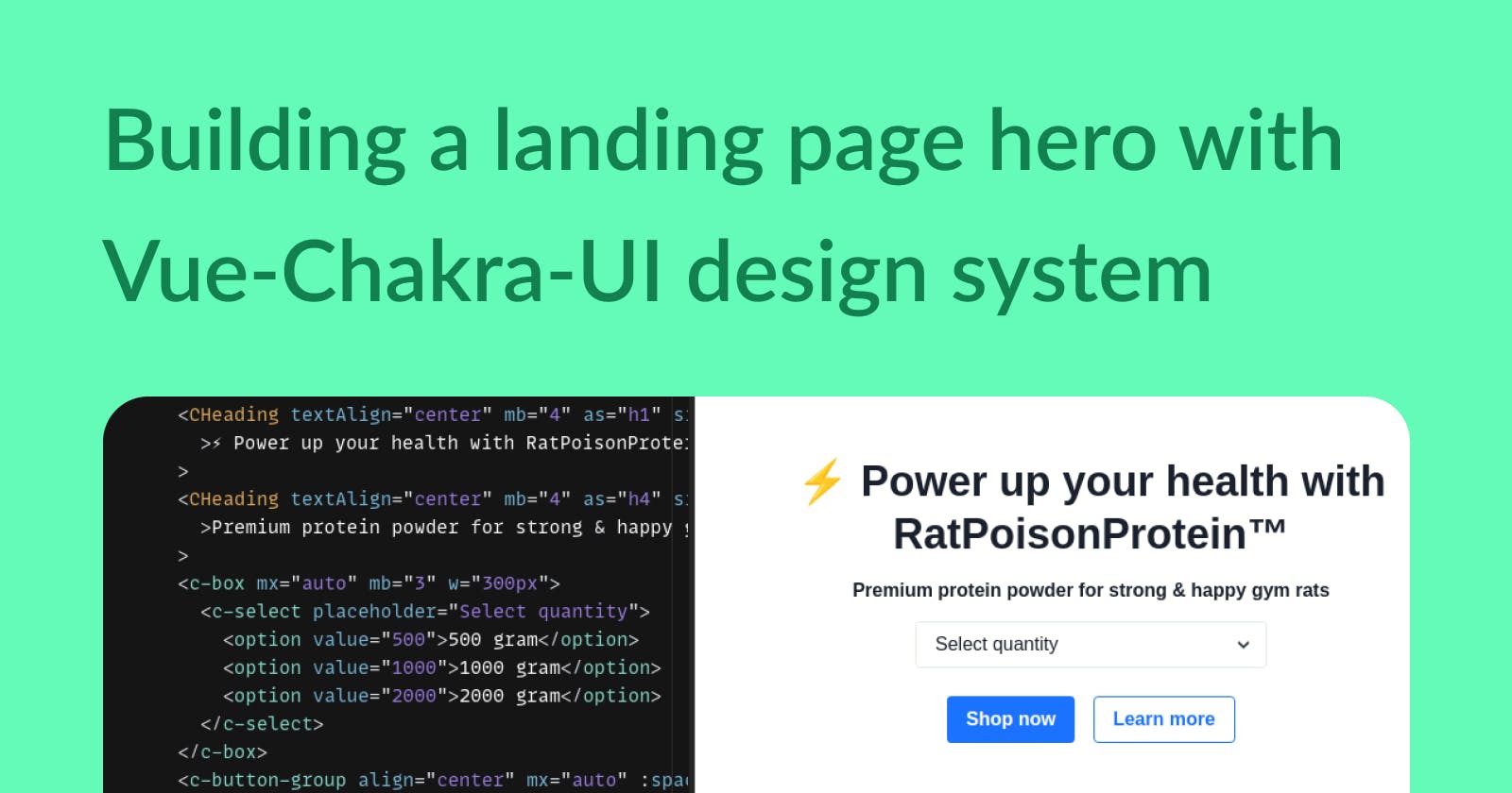
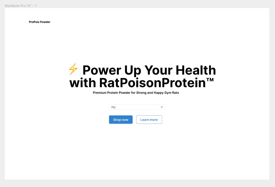
Here is the design of the hero section I put together using Chakra UI Figma kit.
Getting Started
You can get started in three simple steps, here is the link to their docs if you wanna follow along: https://vue.chakra-ui.com/getting-started
Installation
Add/install it on your Vue project
// Yarn
yarn add @chakra-ui/vue @emotion/css

// NPM
npm install @chakra-ui/vue @emotion/css
Usage
main.js
Import Chakra UI plugin in your main.js file.
import Vue from 'vue'
import Chakra, { CThemeProvider, CReset } from '@chakra-ui/vue'
import App from './App.vue'

Vue.use(Chakra)

new Vue({
  el: '#app',
  render: (h) => h(CThemeProvider, [h(CReset), h(App)])
}).$mount()
CReset is included to remove the default browser styles.
app.vue
Now we are ready to import and insert the components we need.
Layout & header
Let's start off with a container layout and website name. Cbox is an abstract component where all other components live. It's helpful to create responsive layouts and provide shorthands to pass in styles via props and composition of new components.
Cflex is also a box that comes with display:flex default. This space is ideally where the top menu or navigation would live.
Skipping the navigation component because I couldn't get justify-between to work, and I couldn't find it in the documentation.
<template>
  <div class="container">
    <c-box mt="10" mx="10" max-w="960px">
      <c-flex>
        <c-heading as="h4" size="md">ProPois Powder</c-heading>
      </c-flex>
        // Hero section code will go here
    </c-box>
  </div>
</template>

<script>
import { CBox } from '@chakra-ui/vue';

export default {
  name: "App",
  components: {
    CBox,
  },
};
</script>
Hero section & headings
Next for the main event, the hero has two headers, a select dropdown, and two call-to-action buttons.
Here we are using Cbox with some styles passed as props. How to center a div design-system-style. lol.
      <CBox
        d="flex"
        w="100vw"
        h="100vh"
        flex-dir="column"
        justify-content="center"
      >
        <CHeading textAlign="center" mb="4" as="h1" size="2xl"
          >⚡ Power up your health with RatPoisonProtein™</CHeading
        >
        <CHeading textAlign="center" mb="4" as="h4" size="sm"
          >Premium protein powder for strong & happy gym rats</CHeading
        >
        </c-button-group>
        // Code for select and CTA buttons here
      </CBox>
And for the last part, here is the code for the select dropdown and CTA buttons.
    <c-box mx="auto" mb="3" w="300px">
        <c-select placeholder="Select quantity">
            <option value="500">500 gram</option>
            <option value="1000">1000 gram</option>
            <option value="2000">2000 gram</option>
        </c-select>
    </c-box>
    <c-button-group align="center" mx="auto" :spacing="4">
        <c-button mt="3" variant="solid" variant-color="blue">            >
            Shop now
        </c-button>
        <c-button mt="3" variant="outline" variant-color="blue">
            Learn more
        </c-button>
    </c-button-group>
Final Thoughts
Moving fast with a system
It's a start, a very fast one - I was able to put this together in just 2 hours which includes going through the course, diving into Figma UI kit, and finally building this in code.
If I were starting from scratch I'd probably waste half a day playing around in Figma, getting the sizes, colors, and whatnot 'perfect'.
But in this workflow, I didn't need to worry about style, accessibility, or writing any CSS code either. This helped save a lot of time and you can trust the design and most of the nitty-gritty parts of code are taken care of by experts. It's a matter of putting together like Lego pieces.
Design systems are magical.
Caution
The downside is the trouble of having to go through the documentation.
At a glance, it can be overwhelming and sometimes it's hard to find stuff. For instance, I ran into trouble getting justify-between to work and had to ditch that.
I can imagine trying to do something more custom can get frustrating but the point of the design system is having a productive workflow between design and code. It's supposed to be a team sport.
DSU course - how to use a design system in code
In this short course, Dan Mall provides a hands-on walkthrough into getting started using a design system with code. It's perfect for beginners and you can finish it in under an hour.
Oh and check out Design System University for more courses if you want to learn more and join the community for exclusive events and conversations.
Here is the sandbox with all the code if you want to check it out.