Advertising Dashboard
A product case study

I am a self-taught developer and product manager based in Malaysia. Currently learning and documenting the journey.
Introduction
Project Duration: Aug 2020 - November 2020
Role: Product Designer & Frontend Developer
Project Status: Live Link
Tools: Trello, Figma, Photoshop & Illustrator
Tech: Laravel, VueJs, Tailwind, Apex Charts
Company Information
MyBump Media is an advertising technology startup based in Malaysia leveraging vehicle wraps to promote brands and products.
For Vehicle drivers - earn with ad wraps on their vehicles and drive around to generate exposure for the advertiser. These users are managed using a mobile app to onboard & track driving and more.
For Advertisers - get access to a client dashboard, also called Crowdvertising Dashboard. to measure the performance of the campaigns with key performance indicators such as impressions calculation, mileage driven, CPM and more.
Background
I joined the team at the beginning of 2020 as the business development and growth hacker. At the time I undertook some marketing projects such as setting up a new CRM system, email automation flows and such while learning the ins of the technology platform.
When covid took over and the whole world locked down, we decided to use the downtime to focus on improving client experience.
Among growth hacking experiments and marketing initiatives, I was assigned to redesign the client dashboard for advertising campaigns.
Situation
The client dashboard was a web app that aimed to provide real-time campaign performance.
However, the existing dashboard had low usage and retention of users. We decided to improve the user experience and redesign the dashboard from scratch.
There was a lot of room for improvement, engagement automation and new potential features and new products which needed to be developed in the dashboard.
Challenge
It was a challenge digitizing a traditional 'offline' advertising channel and getting clients on board with new tech. The objective of the dashboard was to address some pain points and drawbacks associated with out-of-home advertising.
Problems in the existing dashboard
Outdated design and poor user experience & flow of information.
The dashboard was also missing new products being developed which aimed to integrate online advertising into campaigns.
There was a potential to explore and visualize more data regarding campaigns.
Lacked customization and a personalized experience - there was a single shared login per client.
Technical issues such as slow loading time, bugs and etc
Goals
Design a better dashboard experience to increase user retention. Improve data presentation, visualization and engagement to drive dashboard usage.
Design - clean interface and helping users find data easily
Experience - simple to navigate and interact
Satisfaction - users are happy with the campaign updates and performance
My Role
I led the product design, both user experience and interface design for this project. I received constructive feedback from the project manager and graphic designer for improvements. The business dev and marketing team provided useful perspectives as well.
I was responsible for the entire product design process.
Starting from research
Organizing the information architecture
Sketch, wireframing & User Interface design
Overseeing the graphics design & marketing communications. Illustratons were done by the graphic designer.
The project team included a project manager and a graphics designer.
Car Wrap Ad Market
Car wrap advertising is considered a part of out-of-home (OOH) advertising which consists of billboards, digital screens, transit advertising, and street furniture.
Challenges
Here are some general shortcomings of the car wrap advertising market.
Driver recruitment and retention
Quality and durability of wraps
Tracking and measurement
Restrictions in law & regulations
Limited targeting and reach
The technology ecosystem at MyBump addresses almost all of these concerns. The advertiser dashboard for clients solves tracking and measurement.
Apart from this dashboard, there is a mobile app for drivers and an internal admin dashboard for the rest of the list above.
Design Process
The process toward a solution is presented in chronological order as listed below:
Discovery & information collection
Creating user personas
Site map
User flow
Wireframe & lo-fi design
Draft hi-fi design
Internal testing
Revised wireframe & lo-fi design
Hi-fi Design
Discovery
The first task was to collect information and set guidelines as part of discovery.
This helped to understand expectations and grasp an overview of the project. Additionally, served as a reference point for the research.
Personas
Then, after consulting with the team, I tried to get a better picture of the target user of the dashboard and important information about their persona.
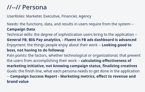
There were 4 types of personas with different motives to access the dashboard.
| Persona | Marketer | Executive | Financier | Agency |
| Need | Campaign data | Campaign data | Campaign data | Campaign data |
| Technical Skills | Social media (FB) fluency | Basic accounts analytics (like Big Pay) fluency | FB ads dashboard is advanced | - |
| Enjoyment | Looking good to boss | not having to followup | - | - |
| Pain Points | Calculating effectiveness of marketing initiative | Not knowing campaign status | - | Finalizing creatives |
| Goals | Marketing Metrics | Effect to revenue | Effect to revenue | Brand |
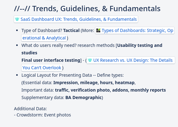
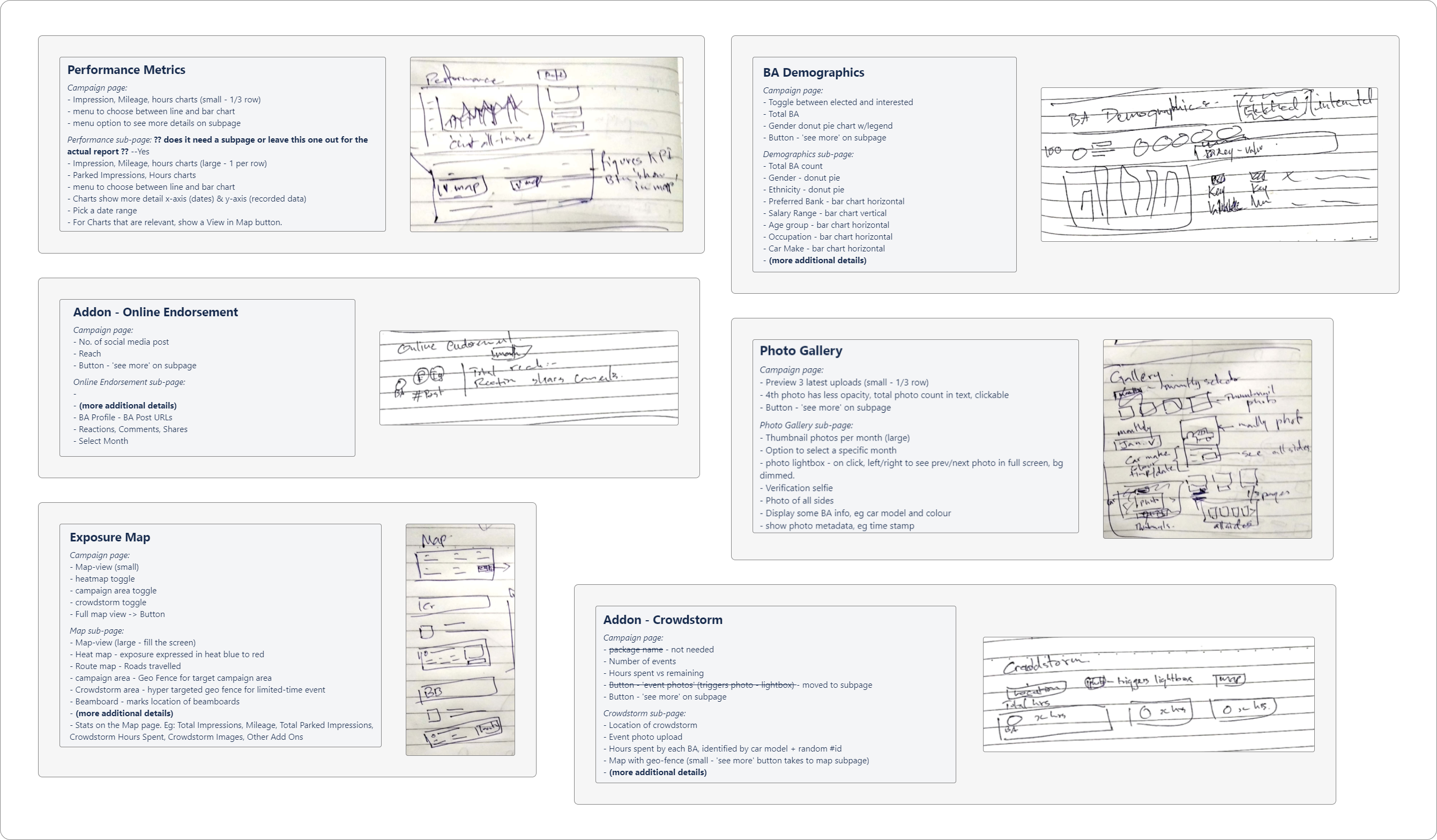
Sketches
This was the requirement and rough sketches around the features and products.
These are all part of the campaign page. The users would see the main KPI and have the option to see more details in their respective subpages.
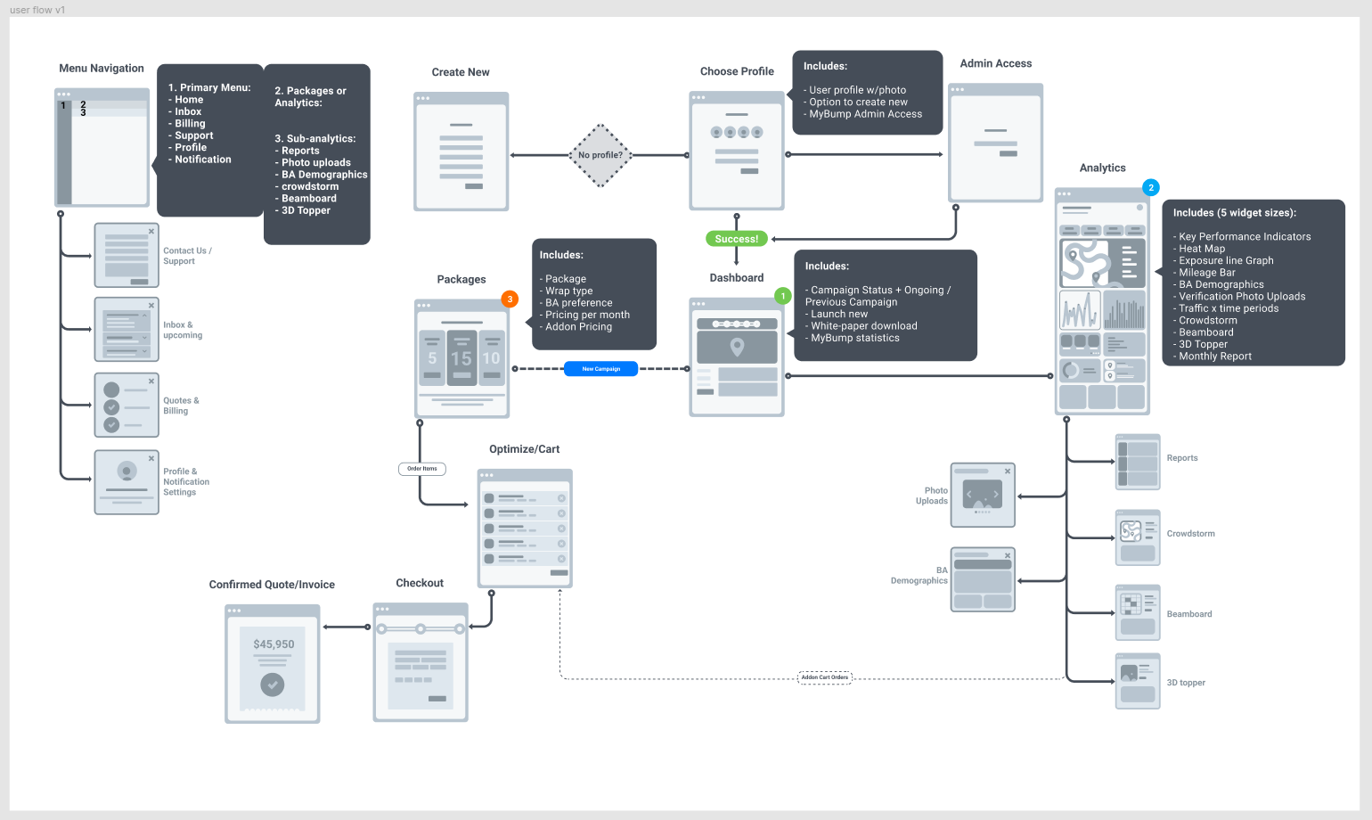
Drafting: Site Map - User Flow - Wireframe
This was the first draft of the site map to organize the pages in the dashboard.
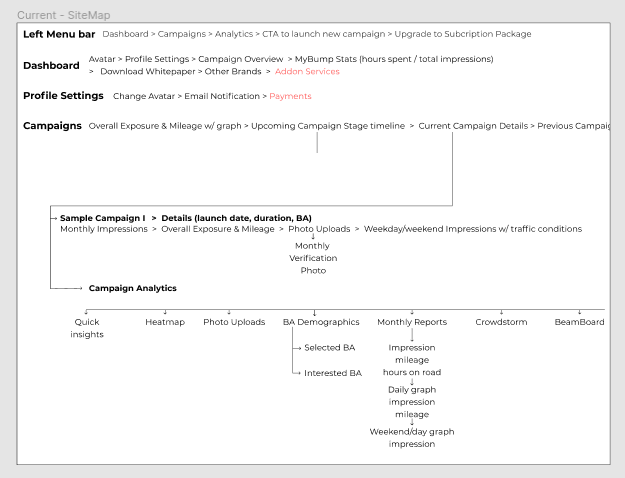
Based on the pages and sections, I tried to move faster by working on a rough wireframe simultaneously.
This was a huge mistake! I have to admit, this wasted a lot of time and overwhelmed me.
Design Draft
Below was the first attempt at designing the campaign page. However, midway into high-fidelity design had to take a step back.
Internal testing showed inconsistencies in the user flow and wireframe, and getting into too much detail at wireframing stage made designing difficult. There were issues with navigation, menu bar and data presentation.
Finalizing wireframe & low-fidelity
After a round of internal discussions and iterations, this was the revised wireframes and low-fidelity design.
Hi-fi Design
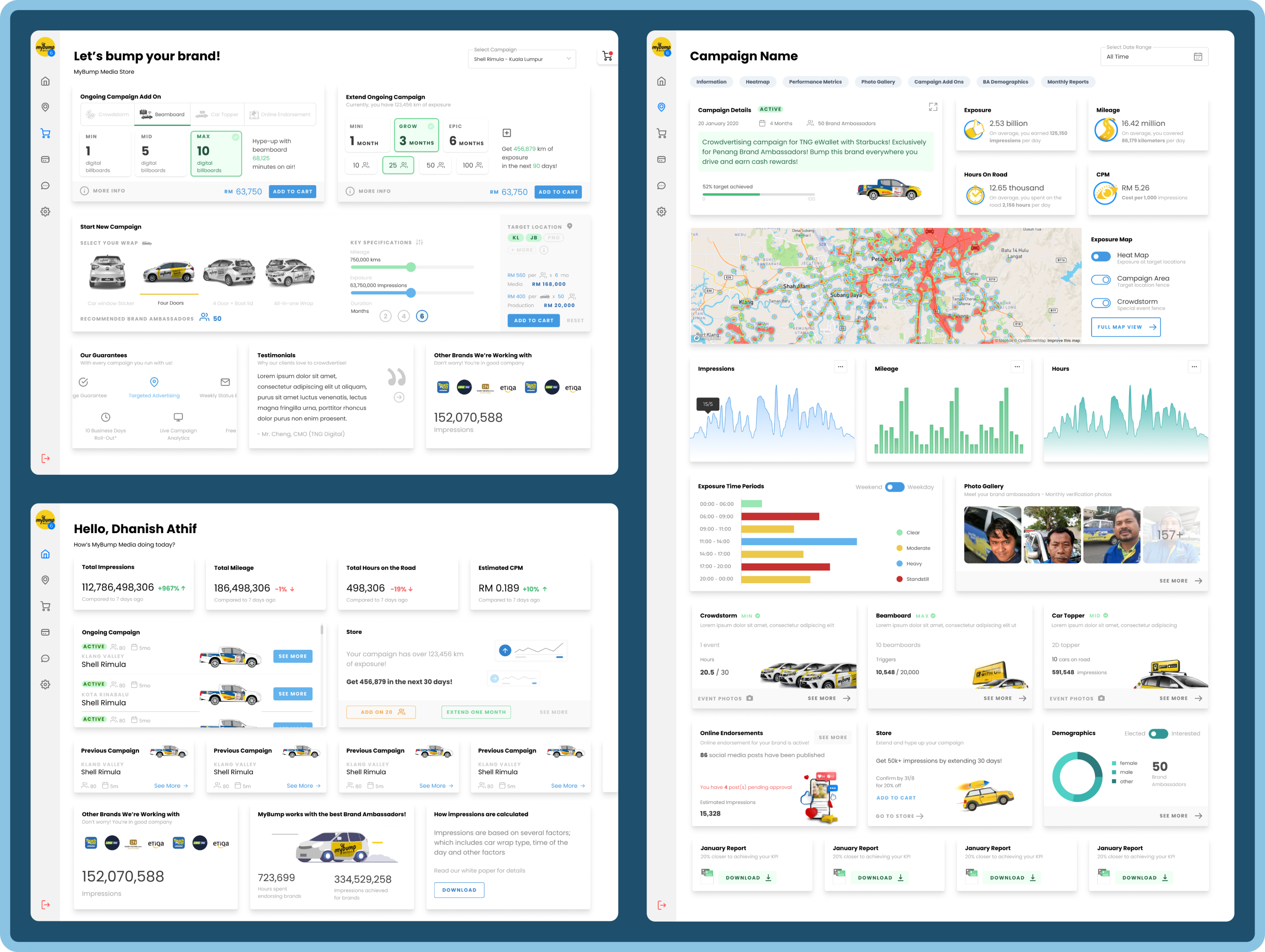
This is a quick overview of the main screens of the previous vs new design.
In the next section, I'll deep dive into discussing issues and design decisions I've taken to improve the design.
Previously
New design
Solutions
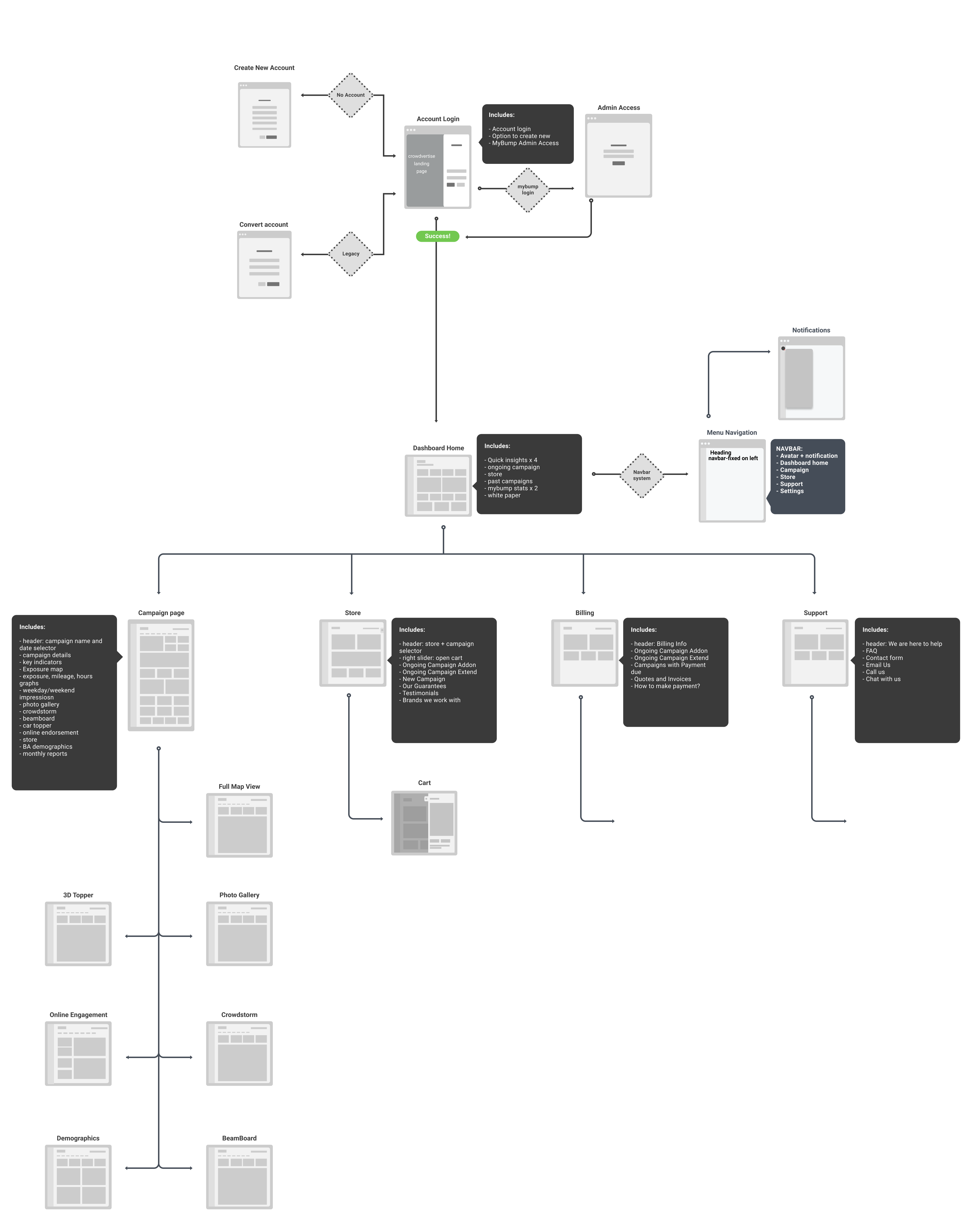
Login Page
The client dashboard is accessed from the login page below.
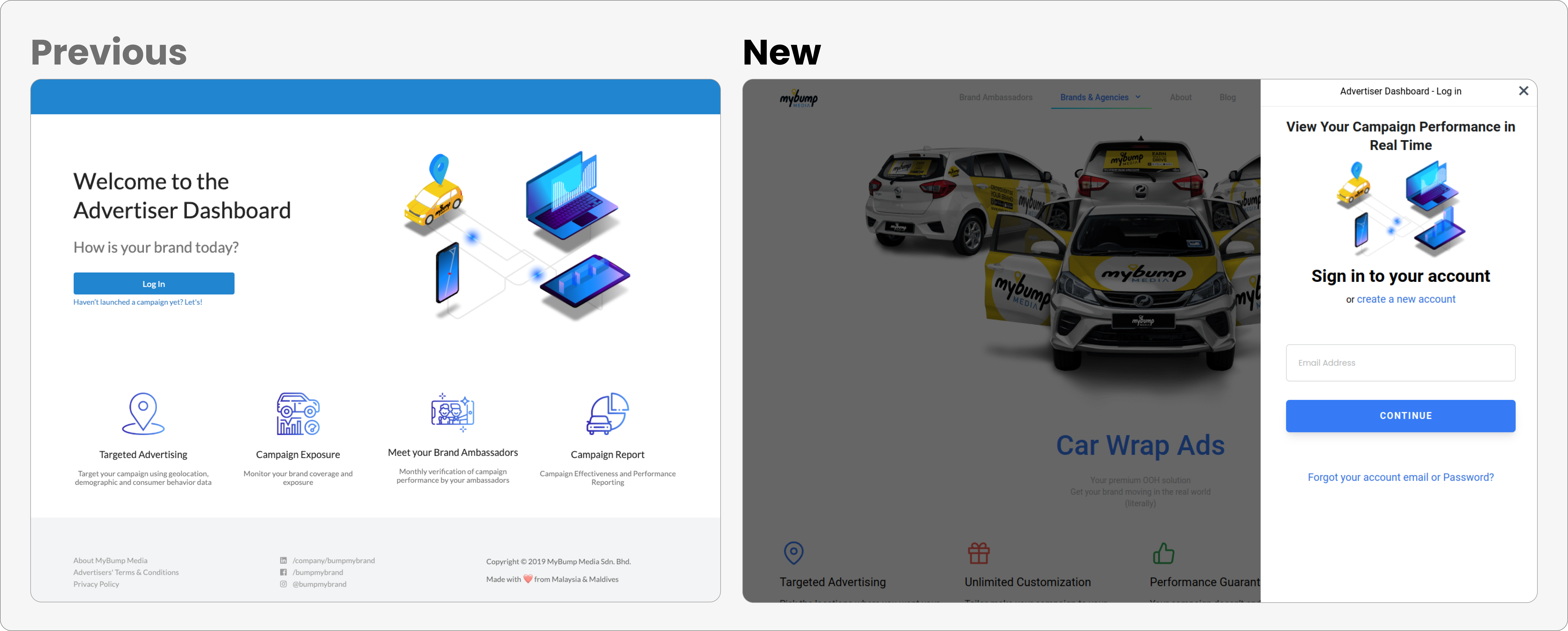
Previously, a log in button on the landing page would lead to this login page, which will show a modal to enter email and password on clicking the button. A direct link to the login page is shared with the user.
In the New login flow, by clicking the log in button the user can directly enter their email address.
This will check if the user exists in the database, if found, the user will see the password field to finish the process.
If the user is not found, a sign-up form is shown to create a new account.
New login has improved by reducing clicks with a condition check to either log in or create a new account. This has also increased number of new leads captured.
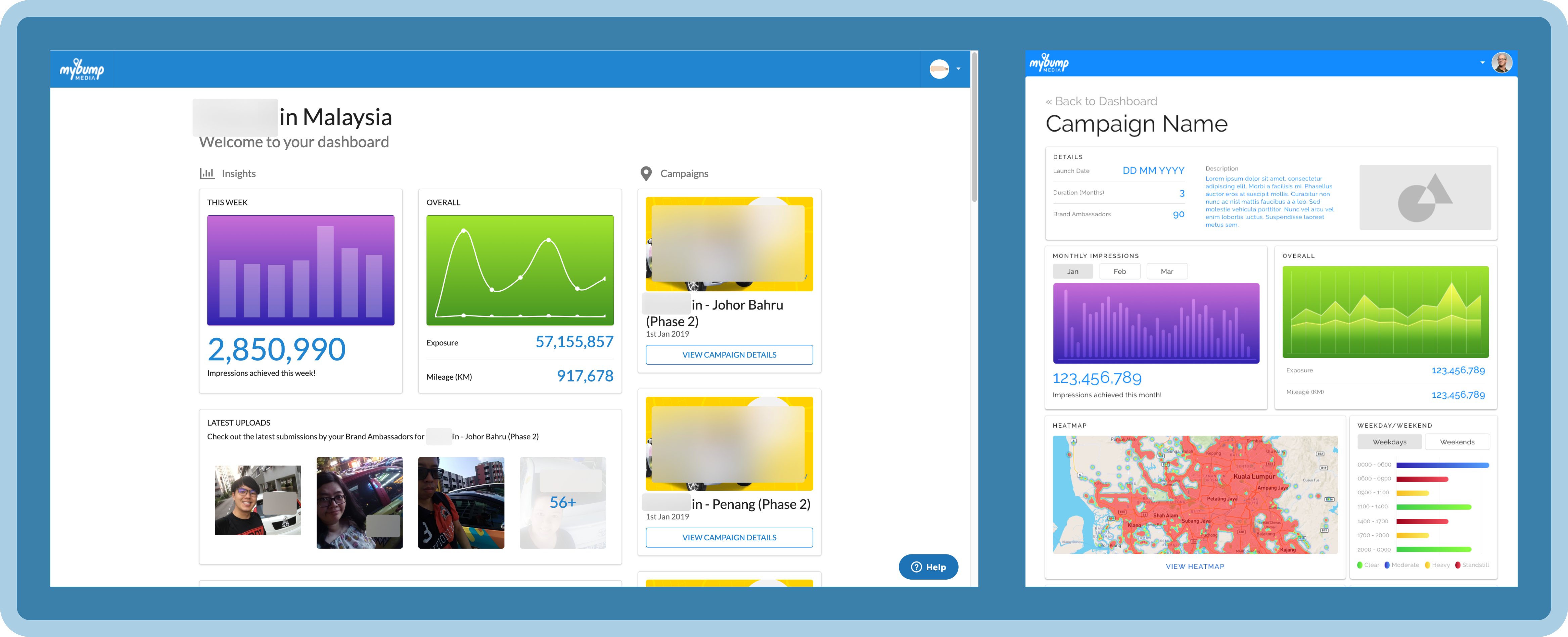
Dashboard Home
This is a before & after of the dashboard home screens.
Issues in the previous dashboard home
There was no personalization. Each client campaign had a single login.
The key performance metrics take a central part of the screen with the purple & green chart, which is repeated inside each campaign page.
Campaigns are shown on the side with a sticker image and a date. It is not clear if it's an active campaign or not.
Images of people are verification pictures for quality control, this data is repeated on the campaign page.
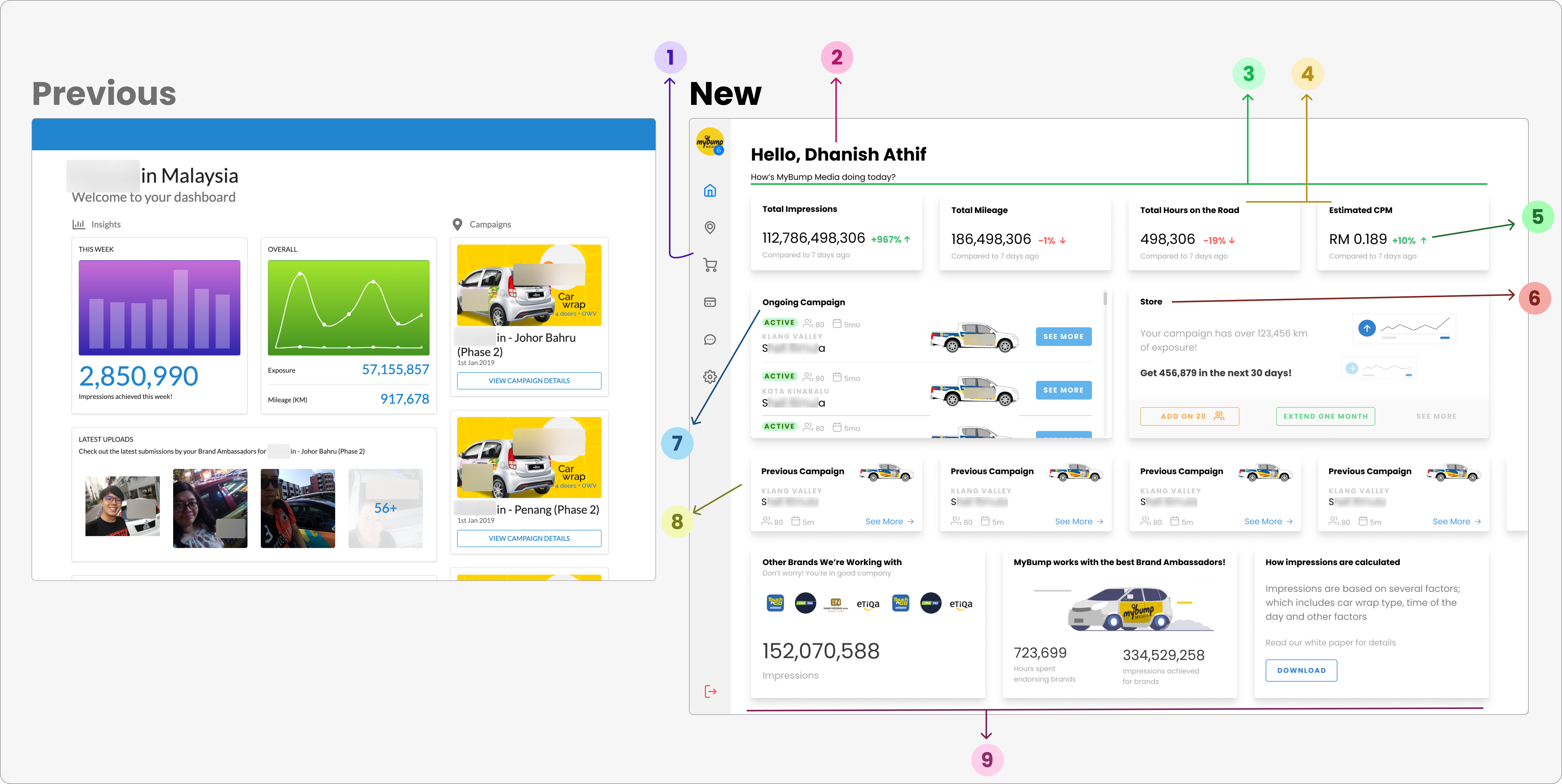
Let's break it down by each point of improvement and understand key changes.
Navigation - Introduce the main navigation system as the left menu bar, which expands on mouse hover. In mobile, this is a hamburger dropdown. Easy navigation.
Personalized greeting - message with the client's name and brand on top.
KPI Grid - The most important key performance metrics on the top grid. Previously, two charts (purple & green) with numbers. The new design shows only the number of the total aggregate across all campaigns.
New KPI - Added two new metrics; hours on the road and estimated CPM. Where previously it was only impression and mileage.
Trends - Active campaigns would show a comparison from the last 7 days.
Store - was not developed and deprioritized. The idea was to let clients plan campaigns on the dashboard and make it (semi) self-serve.
Ongoing campaign - shows more data related to the campaign along with the main CTA button to see the campaign page. Occupies central part of the screen.
Previous campaign - shown separately below, smaller in size to de-emphasize old campaigns but easy to access.
Extra - General statistics about MyBump's journey and link to download the white paper. This explains how the impressions are calculated.
Store
We wanted users to be able to start planning their campaigns and eventually develop into a self-serving platform.
The store was designed for users to put together all products and generate a quote.
I have designed the interaction while in an ideal state and a blank state.
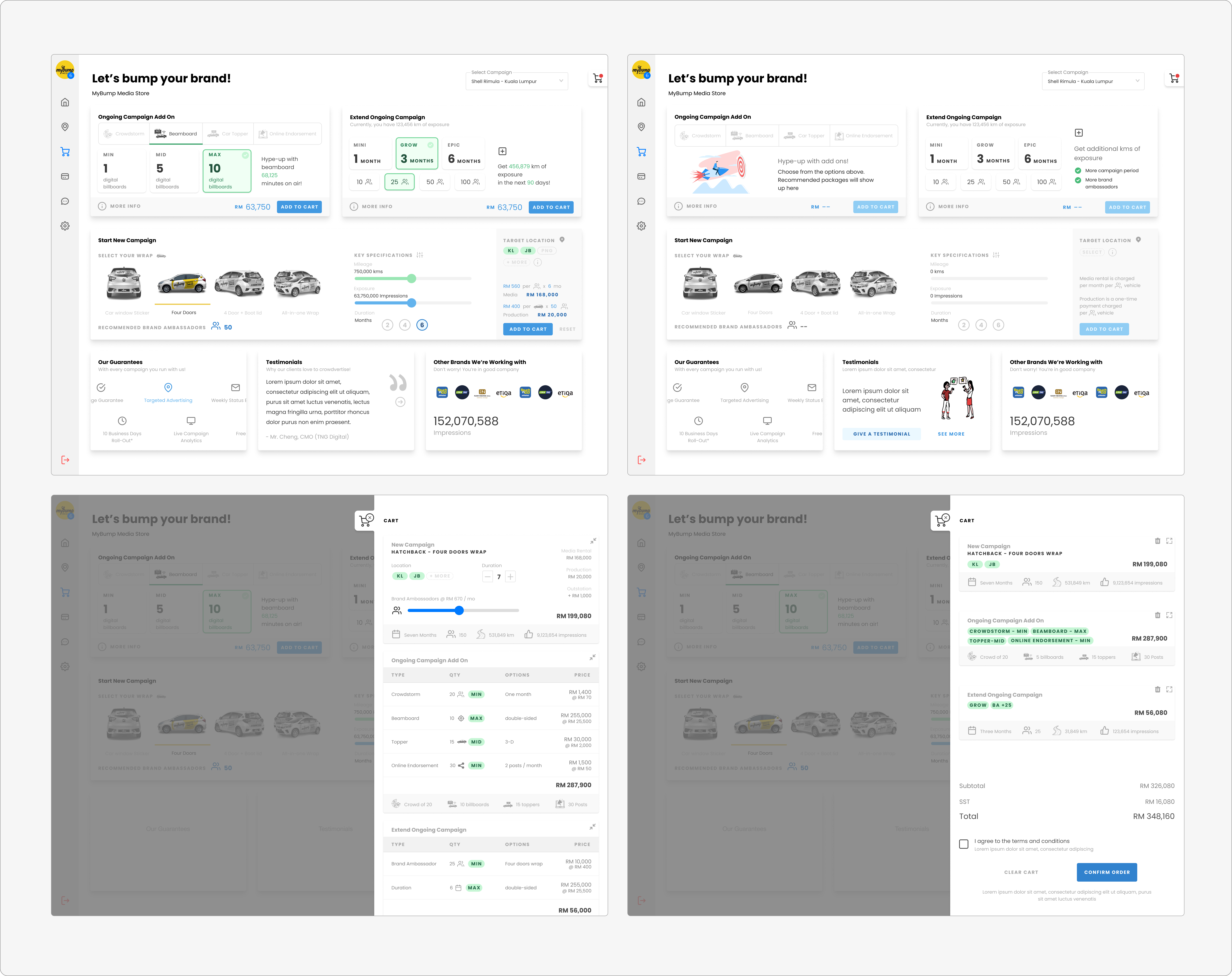
However, during development, this was deprioritized as this demanded a lot of development resources and research showed this would be too complex for our users or they preferred us to take care of this part.
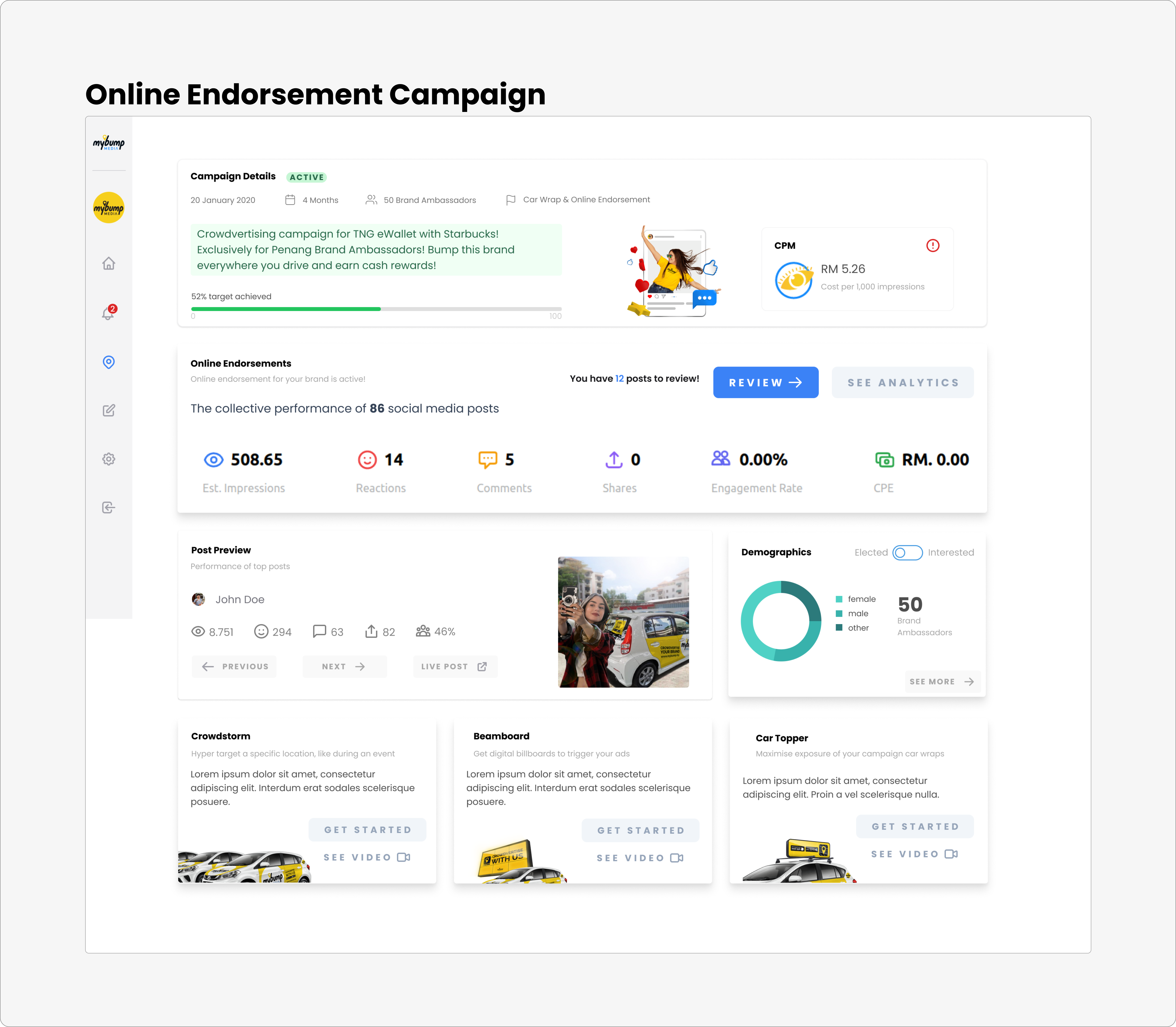
Campaign Page
This is the main page for one particular campaign. Usually, a campaign launched in a different city is considered a separate campaign for driver recruitment and management purpose.
Issues in the previous campaign page
Navigation Issues - The client has to go back home and then select another campaign. For more details, buttons and navigation to subpages were missing.
Missing Information -
Some essential data lacking such as CPM, hours, reporting, etc.
Information on new products and addons is missing.
No monthly reports.
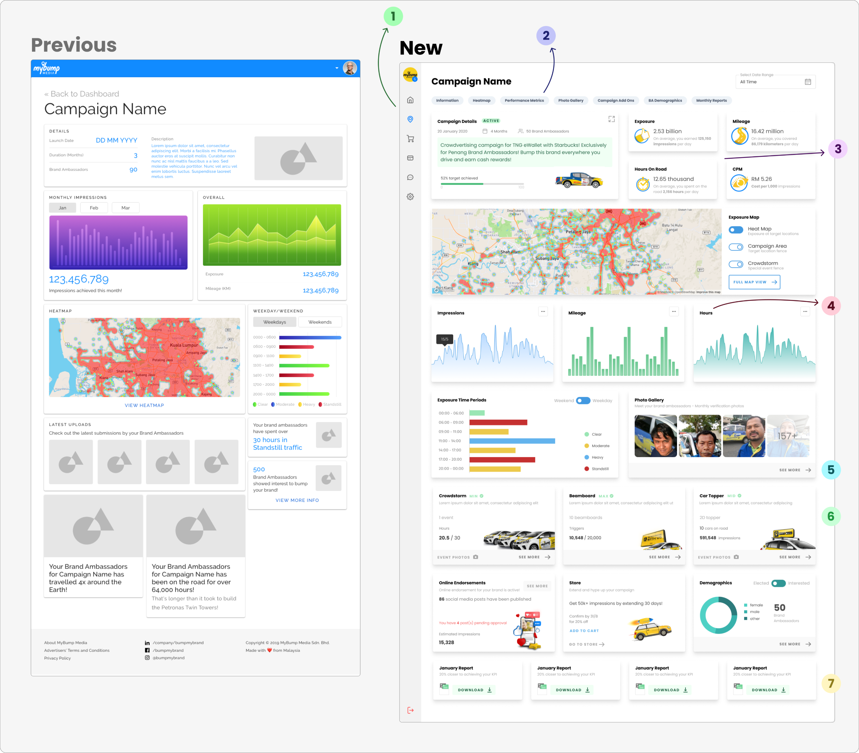
Let's go through key improvements of the makeover
Navigation - The side navigation menu can jump between campaigns without having to go back to the home page.
Sub-Navigation - Under the campaign name, there is a quick sub-navigation to quickly move around and go directly to a particular subpage. This also helps the client quickly see the sections below.
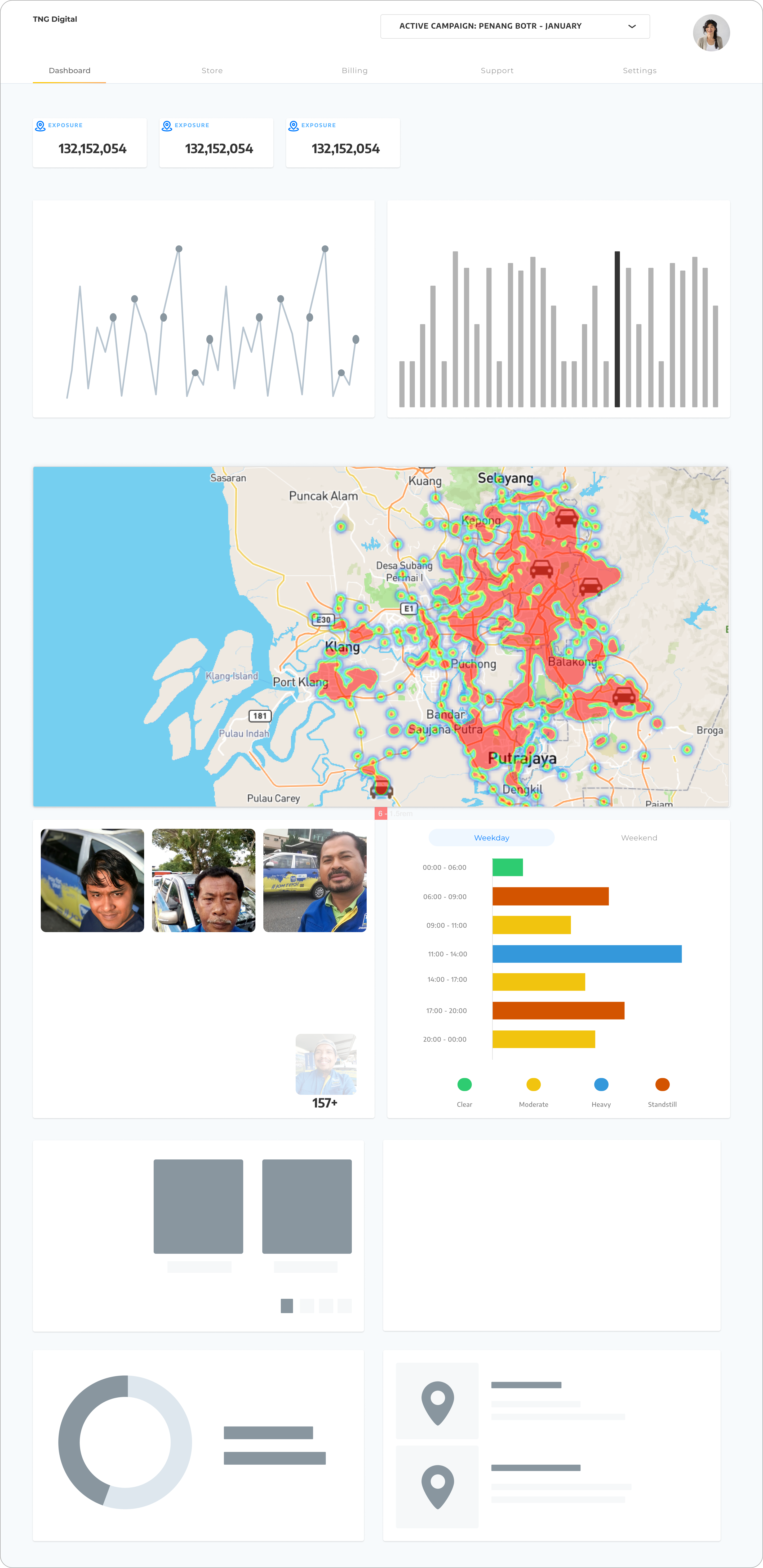
New KPI data - Hour and CPM per campaign are shown on top quad-grid
New chart for hours - Clients can see daily impressions, mileage and hours in one row as a bar/line chart. During development, we went ahead with only line chart, and data on hover is shown with the date.
See More Button - for sections with subpages with more details
Addon and new products - Information about integrated products are shown. For a campaign without any addons, it'd show some information about the product and link to the landing page section for more details.
Monthly Reports - Option to download monthly reports for campaign duration. This section was later moved to the top after a few months of development in another round of design iteration.
Subpages in Campaign
Gallery
This is the photo gallery with monthly photo submissions by the drivers. This page is verification for retained ad wrapped on the vehicle.
Let us discuss the issues and key decisions below.
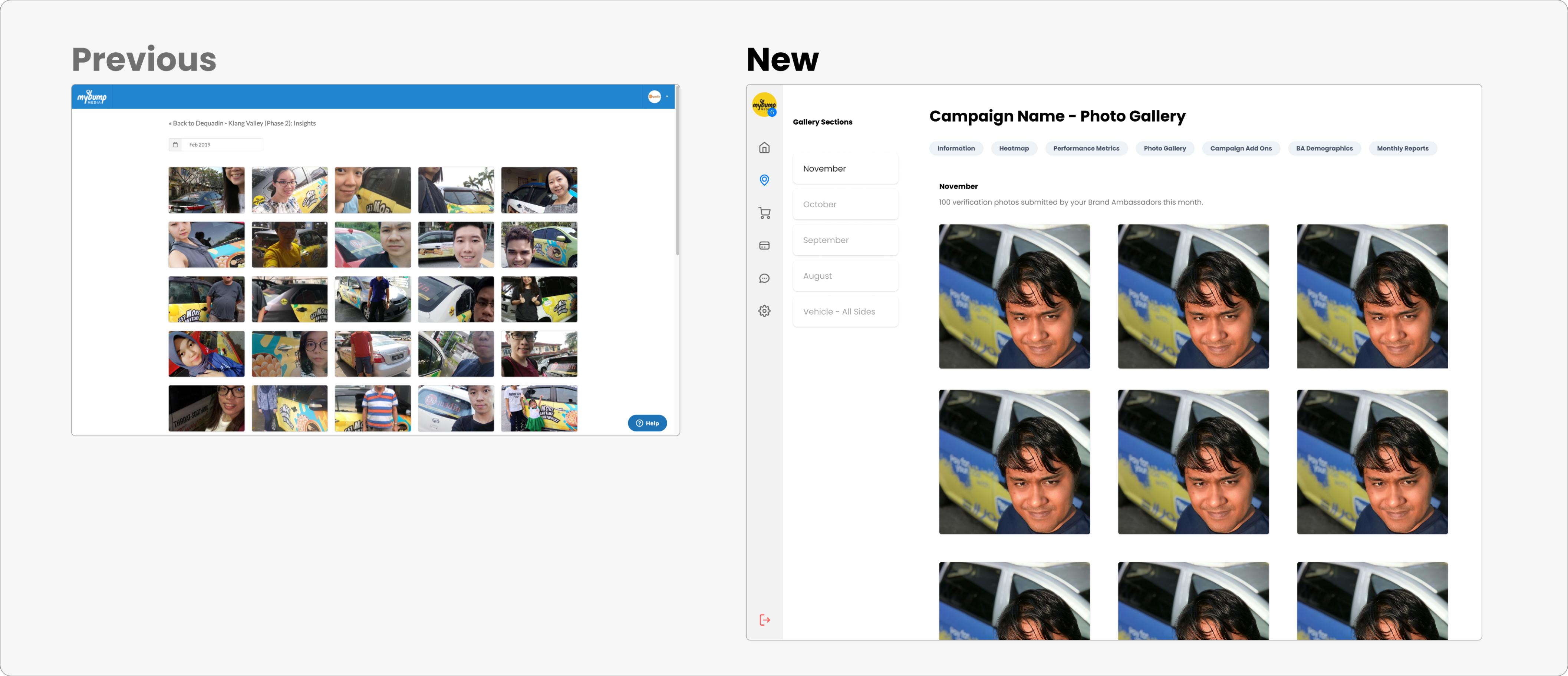
Navigation - There was no access to the navigation system. Have to go back to the campaign page. But the new design offers in-campaign navigation on top and also main navigation on the left side so users can move around easily.
Page Menu - There was a drop-down to select a specific month, to see the photos of that month. In the new design, the left bar has an additional menu for in-page navigation. Users can see all the available months as options.
Key Metric - Lastly, the new design users can also see the number of photos submitted during a particular month.
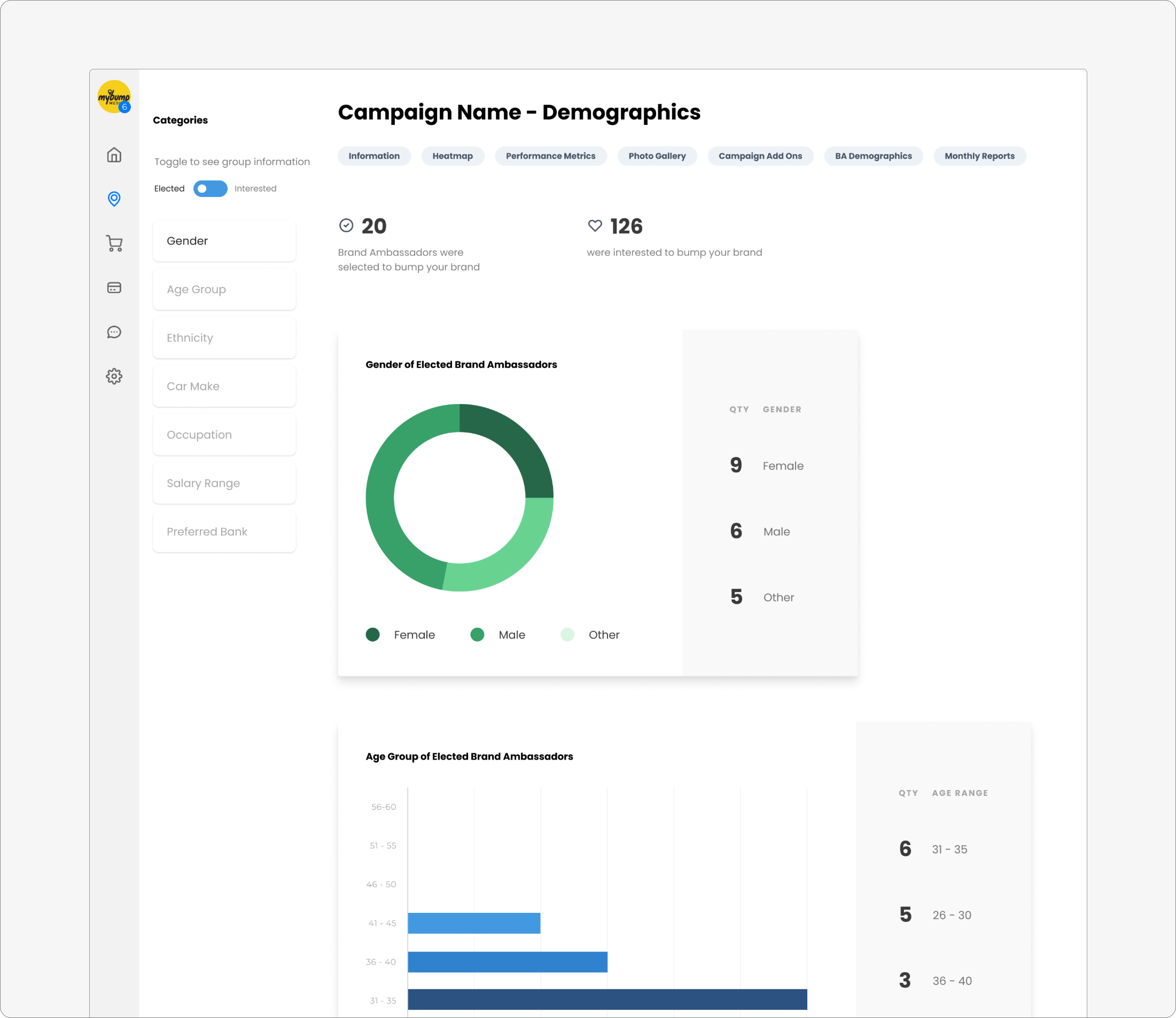
Demographics
Next, this is a new addition. This page provides demographic data of the drivers who are elected and campaigning for the brand and the people who were interested to campaign for the brand.
The user can see 7 datapoints. There might have been a preference or selection criteria for the driver in campaign and hence this page serves this purpose as well.
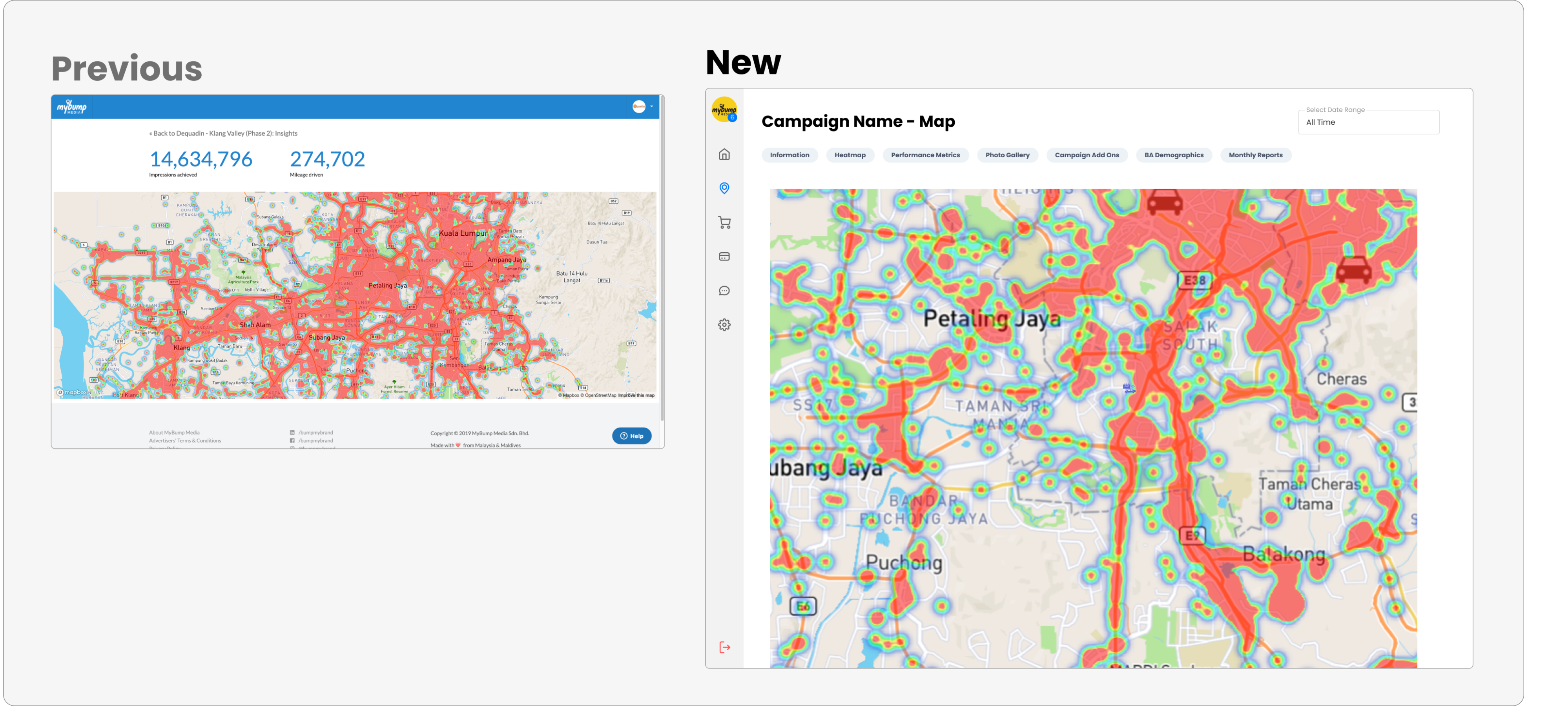
Heat Map
This is one of the most popular features among users. This heatmap is generated for each campaign based on the tracking data we collect from drivers via our mobile app.
Users can see from this page all the hot spots and geographical areas where the drivers frequently travel.
The new design does not show key metrics here as it is already in the main campaign page.
Additionally, side and top navigation help users move around easily now.
Online Endorsement
This is a new product, which integrates car wrap and online social media marketing with user-generated content.
The two screens below are sub-pages for online endorsement.
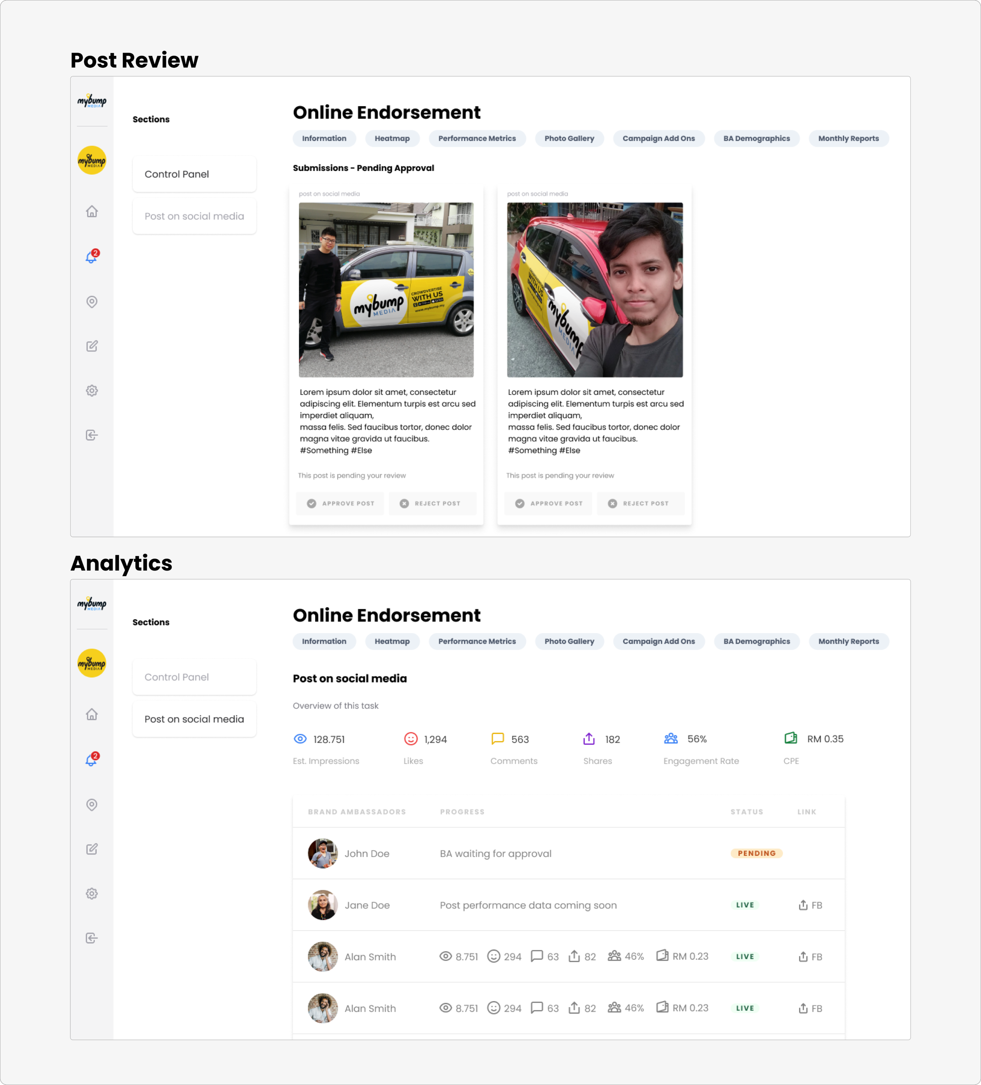
Post Review (Control Panel) - The user approves or rejects photos and captions submitted by campaign participants.
Analytics - Users can check the status and performance of posts on social media along with links to live posts.
This product was a client favorite and helped drive dashboard engagement, especially with the approval process in place.
We went on to offer this as a stand-alone product without car wrap and later improved the campaign home page to make this feature more prominent.
Crowdstorm
Crowdstorm is used by advertisers to create hype around a specific location and limited time. Usually, there would be the distribution of goodies and such by brand promoters who also take photos.
This product was an add-on to a car wrap campaign.
Later on, offered as a standalone product as well.
The below screen shows event details, photos and key metrics.
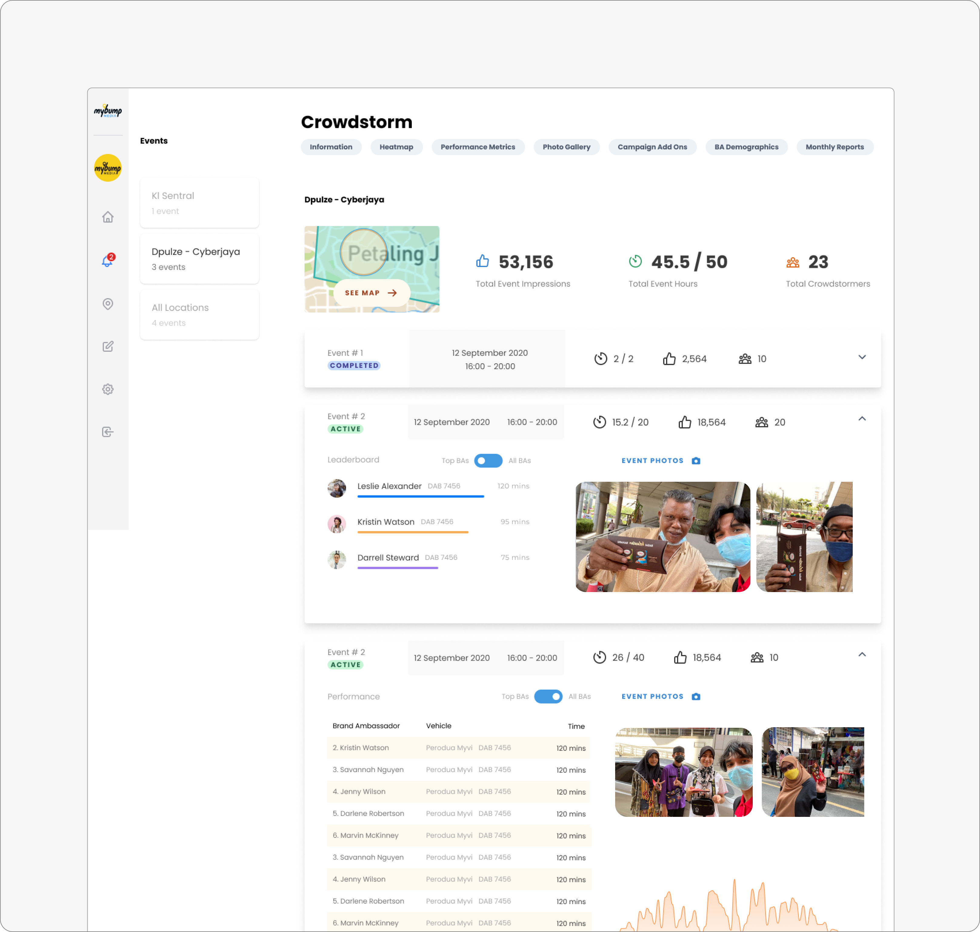
Note: During development, this page was deprioratised and is currently done manually and uploaded to campaign page as a report.
Conclusion
The impact of this project was multifold.
Overall experience was improved. We ran a google form survey with all clients who ran campaigns and achieved an overall satisfaction rating of 4.6/5.
The dashboard is one of the top USPs for conversions. Many clients have mentioned what the dashboard offers are one of the biggest differentiators in the buying decision.
Since this first round of design, the advertiser has continuously grown and improved with new features.
Learnings from the project
This was a very challenging project which pushed me to learn a lot of things on the job. The growth curve was immense as a designer, having created and delivered a major milestone for the business.
There are too many learnings for me to list here. But here are the top learnings away from this project:
The best way to learn new things is by doing
Be ready to pivot and adapt as the project progresses
Get feedback early from stakeholders
Collaboration is key, found productive ways to work remotely
However, if I were to take on this project today, I would take a product-led growth approach and design in smaller cycles with development. By frequently measuring key metrics and learning about the design impact and forming hypotheses for the next cycle.
Next steps
There were several improvements we introduced in later rounds of design and development. The most noteworthy ones are:
Automatic weekly and monthly reporting
Notification system
Some designs got deprioritized during development. Had there been enough resources, I'm sure they'd have provided more value for our users.
A product is never finished. The next major milestone for this product would be evolving into a marketplace where users launch and manage their campaigns and users.
We are still a long way from there though.
Oh wow. Was not expecting to write such a long read.
If you've made it here, I hope you enjoyed reading this as much as I enjoyed writing it.
If you have any questions, I'd be happy to share more.


